
With name intact, Hillcats overhaul look
In Lynchburg, the Hillcats name remains. The team's look, however, is brand new.
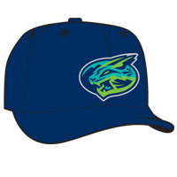
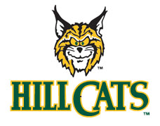
The Hillcats, Class A Advanced affiliate of the Cleveland Indians, unveiled this new look during Thursday evening's "logo launch party." Gone is the cross-eyed, smirking feline previously featured in the team's primary logo, which employed a green, orange and black color scheme. In its place is what team president Chris Jones described as a "clean, fresh look." The Hillcat in question is now fierce, focused and angular, depicted in swaths of teal, lime green, navy blue and black.
Jones, who assumed his current position after the Elmore Sports Group bought the Hillcats following the 2015 season, said the new logos are inspired by Lynchburg's natural beauty.
"We have one of the most unique views in baseball, from the first base side of [Calvin Falwell Stadium]," he said. "The sunsets behind first base, over the Blue Ridge Mountains, are just unbelievable. The mountains look so blue, so we had to have blue in there. And then the green made sense, because if you drive around town you see a lot of bright greens -- the trees, the bushes, the grass. And it's not a neon green; it's more of a lime green.
"So dark blue is the main color, accented with teal, and the green is more of a highlight," he continued. "I think what we wanted was almost a Penn State [Nittany Lions] type of look, more fierce than the Grinch-looking cat [from the old logo]."
The team's gray road caps feature a swooping 'L' depicting the cat's foot, while an alternate mark depicts the entire body as he (or she?) is in the midst of a full-extension leap. The logos were designed by Brandiose, a San Diego-based firm that, most recently, designed the Florida Fire Frogs logos that were unveiled yesterday.
Lynchburg's previous look launched in 1995.
|
The new look is a pronounced departure for Lynchburg, whose previous logo dates back to 1995 (the first year the Hillcats name was used). The change is mild compared to what could've been, however, as in July the club announced a Name the Team contest that included Derechos, Doves, Lamb Chops, Love Apples and River Runners among the finalists. "Hillcats" was also included, however, and this "if it ain't broke, don't fix it" option prevailed.
"We originally weren't planning on changing our name. But like the other teams in the Elmore Sports Group, we used Brandiose to help with the rebranding," said Jones. "In talking with [Brandiose co-founders] Jason [Klein] and Casey [White], we thought about a name change. We weren't opposed to looking at what's out there. But [the other names] got mixed reviews. Lynchburg's an old town, baseball's been around a long time, and with Hillcats I think the fans found something they like. So we let them vote and, overwhelmingly, they chose Hillcats."
The logos were unveiled at Fifth and Federal, a new bourbon bar and barbecue restaurant in Lynchburg operating in a 92-year-old building that originally opened as an Esso Gas station.
"[Fifth and Federal] fits in with what we're trying to do, a combination of the old and the new," said Jones. "Tradition roars on."
Benjamin Hill is a reporter for MiLB.com and writes Ben's Biz Blog. Follow Ben on Twitter @bensbiz.