
Southern League announces new logos
MARIETTA, Ga. -- The Southern League of Professional Baseball Clubs announces a formal re-branding of its logo, the first such design change in 21 years. Using the expertise of branding expert Todd Radom, the league was able to find a pair of logos that symbolize both the circuit's rich past and promising future.
The league's primary insignia features a circular design similar to the logo layout used from 1994 through 2015. Bordering the logo is a ring colored in the familiar Southern League gold. Positioned inside the ring are the words "Southern League" written in white on a navy background. A gold and white banner highlights the bottom of the ring with the league's original establishment date of 1885.
The inside circle contains a design familiar to fans of years past, the dark diamond, which was the featured emblem of the Southern League prior to 1994. Radiating from the dark green diamond is the sunburst pattern, a mark used to embody positivity yet to come. The South, with its promise of sunshine and warm weather, has served as a lynchpin that attracts new investment throughout the league, as evidenced by the development of three new parks over the past four seasons. The prominent "SL" at the center of the logo modernizes the same featured letters of the post-1994 logo, using Southern League gold and white.
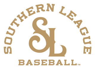
The secondary logo, the first time the League will use one, displays the "SL" using only Southern League gold with the script "Southern League" and "Baseball" outlying the letters. The secondary mark can be used for embroidering purposes or as letterhead.
"After discussions with Minor League Baseball, it became apparent the Southern League was in need of a touch-up, both aesthetically and for graphic-design purposes," states League President Lori Webb. "Thanks to the help of MiLB, Todd Radom and of course, our member clubs, we feel that our new logos are more crisp and modern, while still maintaining the strong symbols associated with the tradition of Southern League Baseball. The sunburst surrounding the diamond will hopefully serve as an indication of great weather to come at all of our ballparks!"