
Hot Rods roll out new look for 2016
After seven seasons, the Hot Rods are giving their look a fresh coat of paint.
The Rays' Class A affiliate unveiled a new set of logos, colors and jerseys as part of a rebranding Thursday, switching up the club's familiar red and yellow-themed look to one with orange and blue. The vintage automotive vibes remain, but for longtime fans, the team will look like it just rolled off the showroom floor on Opening Day.
"I think we're pretty optimistic that they'll embrace it," Hot Rods general manager Adam Nuse said, referring to the club's fans. "I think it's a cleaner, fresher look -- more modern."
Bowling Green's primary logo includes a new "BG" mark inside a circle, an overall look that may remind some fans of the Houston Astros' recent rebrand. Secondary logos include a stylized Hot Rods wordmark for the jersey, a wrench-and-bat emblem and two more of a baseball and a retro-looking car, both with flames as a nod to custom hot rods.
Nuse said the new look was created by the design firm SME, which also worked on the Triple-A Reno Aces' branding -- the Aces are owned by the same ownership group as the Hot Rods, Manhattan Capital Sports.
"The process started about a year ago: we partnered with SME, who is the same company that did the Miami Marlins and a lot of pro teams," said Nuse. "We went through a pretty lengthy process, going through different looks and styles, and I think, ultimately, we wanted to rejuvenate it and freshen it up a little bit."
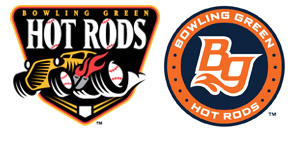
The Hot Rods' old logo, which was used from when the team relocated in 2009 until 2015, featured a custom roadster with baseball wheels and flaming tailpipes over a black badge, giving the club a fast, garage-inspired racing look. Bowling Green's name is a nod to the area's connections to cars and racing, including the nearby National Corvette Museum and Chevrolet's assembly plant that produces Corvette engines.
Nuse said the variety of colors and the shape of the old logo presented challenges to the team, especially when it came to merchandise.
"We're certainly happy with [the new look]. Previously, we had a lot of different colors, and now we're kind of focusing on the navy and the orange. It simplifies things a bit and makes it a little more modern. Our new logos are a little more symmetric than the other ones. I really liked our old logos, but they made it hard graphically -- they created some centering issues -- and I think our new stuff avoids those. They're easier to fit on graphic pieces and merchandise."
The Hot Rods' new color scheme is a reference to Kentucky being the Bluegrass State, Nuse said. Early on, the club wanted to go with a darker royal blue color but lightened it up a bit after encountering challenges.
"We went through probably a dozen different color options that were floating out there. At one point, we thought about something navy and baby blue to go along with the Rays affiliation, and then somebody came up with navy and orange," he said. "It started with a dark royal blue and orange. Dark royal blue has 12 different variations, so it became almost impossible to match everything. So we had to go back and make it more like the Mets' royal blue and orange, or more of the Astros navy and orange, or the Tigers."
The new logos contain a few subtle elements. Nuse said the 10 dots in the two circular logos represent the 10 counties making up South Central Kentucky. The seven horizontal lines behind the wrench-and-bat logo are a nod to the seven other teams in the Midwest League's Eastern Division. What appear to be flames in several of the logos are meant to also reference "the rolling hills of Kentucky."
"We're in the Bluegrass State, so I think the color blue was the main color in just about every color we were working with," said Nuse. "The accent changed, but we wanted to be blue for Kentucky. Western Kentucky University is red, so they've taken claim to the color red. We wanted to opt away from that. I think blue is consistent across the board from a local tie-in. The orange is kind of a modern color -- some of the sports cars are starting to use to that orange. It's more of a sleek, hot-rod color."
Nuse said the team is especially fond of the wrench used in what he calls the "patch" logo.
"We're pretty excited about the bat crossed with the wrench. Big picture, there's a lot of fun things we can do with the wrench, just being a unique piece," he said. "We talked about making a hat with a wrench on it. Wrenches kind of represent the blue-collar workers in Kentucky and the Corvette plant in town. That's the tool of the trade for hot-rod workers. And crossed with a bat, obviously, the bat is the tool of our trade."
Nuse said the club's road jerseys will say "Bowling Green" in a Corvette-like typeface. The home uniform's name has flares on some letters "representing speed."
Danny Wild is an editor for MiLB.com. Follow his MLBlog column, Minoring in Twitter.