
Subtle changes help teams refresh looks
When the Minor League season ends, another season begins.
New logo season, specifically -- that time of year when Minor League teams nationwide rebrand, refresh, revive, renew and rejuvenate their sartorial realities. The aesthetic changes that have taken place thus far have veered toward the subtle side but are still worth discussing and, of course, debating.
What follows, then, is a roundup of that which has been unveiled thus far.
Hickory Crawdads
Refreshed logos, new uniforms
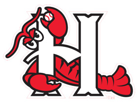 For the entirety of their 23-season existence, the Crawdads' primary logo featured the team's titular crustacean lounging behind (and wrapped around) the letter H. That mark remains - it will still be featured on the home cap - but it now has a full set of new logos to complement it.
The Crawdads report that the "focal point of the redesign" is the primary logo, which "[introduces] the new team font and 'Crawdads Blue' color." This logo depicts a crawdad lurking in North Carolina freshwater, his eyes just above the surface and his submerged claws cradling a presumably waterlogged baseball. The three alternate logos -- "reserve claws", if you will -- include a light blue depiction of the state of North Carolina, with a claw pinching a star depicting Hickory's place on the map.
The Crawdads' "refresh" was handled by Louisville-based Studio Simon, a veteran of the Minor League logo design business.
"As much as we enjoy working together with teams to develop new brand identities from scratch, we equally relish any opportunity we get to refresh existing identities and then build them into fully fleshed-out systems that give clubs more tools at their disposal than they ever had before," said Studio Simon owner Dan Simon, in the team's press release.
Sacramento River Cats
Alternate "Sactown" logo
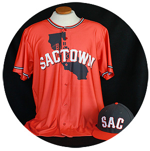 The River Cats switched affiliations prior to the 2015 season, from the A's to the Giants. On Tuesday, they unveiled black and orange "Sactown" hats and jerseys that "draw inspiration from both Sacramento's and San Francisco's iconic bridges, as well as from both cities' baseball history."
The bridges in question are Sacramento's Tower and San Francisco's Golden Gate, but clearly this is a logo that emphasizes California's capital city above all. The jerseys say "Sactown" across the chest; the hats forgo the "-ramento" and simply read "SAC."
"Obviously it has a Giants influence with the colors and the bridge, but our focus was on making something unique to 'Sac' that people would be proud to wear," said River Cats graphic designer Mike Villareal of the new duds, which will be worn during all Friday home games.
Charleston RiverDogs
Rejuvenated logos, new uniform
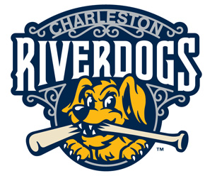 In the headline of their press release, the RiverDogs announce that they have unveiled "refreshed" logos. In the first sentence of said release, they refer to them as "revived," while the second paragraph goes with "rejuvenated." Finally, in the third paragraph, general manager Dave Echols calls it a "rebranding."
Regardless of the specific terminology, the RiverDogs' new look centers around a revised primary logo in which "Charleston" is rendered within a wrought iron gate. This is a reference to a common architectural motif of "The Holy City." And speaking of Charleston's long-standing nickname, the RiverDogs also unveiled a pinstriped "Holy City" jersey. This pinstriped uniform top, which also serves as a reference to the team's Yankees affiliation, features an interlocking "HC" in which a halo is placed around the left-hand pillar of the "H."
"The idea behind our rebranding effort was to create an updated and contemporary look for the Charleston RiverDogs' 20th season and beyond," said General Manager Dave Echols, in a press release. "The logos have the classic look everyone is accustomed to but have been designed by the great folks at Studio Simon to include a progressive touch, giving it a great look I know our fans will like."
Ogden Raptors
New primary logos
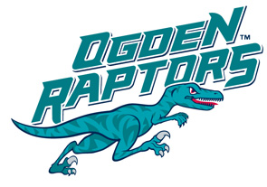 As detailed in last month's MiLB.com article, the Raptors have brought "modern flair to a creature with roots in the Cretaceous era." Raptors president Dave Baggott said that the team's new logo, which will be featured on the home and away caps, depicts mascot Oggie "on the run."
The team also introduced an alternate logo featuring a raptor talon emerging from within the "O," the design for which had originally included a drop of blood dripping off of one of the claws. The new logos were designed, gratis, by New Era. The cap company plans to recoup its design expenses via increased sale of Raptors merchandise.
"We want people to know that Oggie is on the move, he's on the prowl, he's looking for something to hunt," said Baggott. "In baseball terms, that means we're in the hunt for a championship."
West Virginia Power
New alternate logo
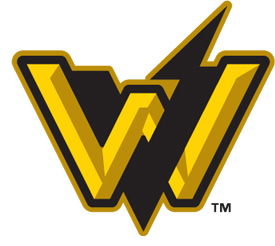 The Power, seeking to highlight both their Pittsburgh affiliation and regional identity, have unveiled a black and gold logo featured an interwoven "WV." This logo, designed by Brandiose, will be displayed on the club's black road caps as well as an alternate white home cap.
"We wanted to add a new team mark that stood out to designate where we are from," said Power president Ken Fogel, not mentioning the fact that "West Virginia" is the only regional designation used by more than one club (the West Virginia Black Bears, also a Pirates affiliate, played their inaugural season in 2015).
But that's not all!
Moving farther into the realm of the subtle, here are a few more logo and uniform changes from across the Minors.
Albuquerque Isotopes: Heading into their second season as a Rockies affiliate, the Isotopes unveiled a new alternate cap featuring the primary logo, in purple, against a black background.
Lexington Legends: The Legends have officially switched their home and road caps, with players taking the field at home in the team's much-ballyhooed mustache headwear.
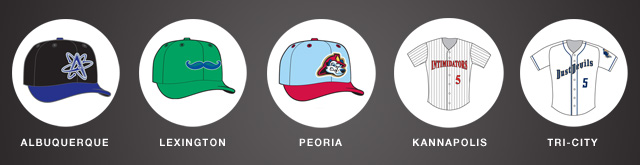
Peoria Chiefs: A new alternate cap features Homer, the Chiefs' fire-fighting Dalmatian mascot, against a light blue base.
Kannapolis Intimidator: The Intimidators have added sleeves to their home jerseys, which are white with black pinstripes.
Tri-City Dust Devils: The Dust Devils added numbers to the front of their uniforms.
Benjamin Hill is a reporter for MiLB.com and writes Ben's Biz Blog. Follow Ben on Twitter @bensbiz.