
Top hats: 2020's most popular caps
Minor League fans love a good ballcap. Even when they can’t go to the ballpark. In a year without games, fans from all over showed support for their favorite Minor League clubs with hat purchases. Whether it be the local ties, the bright colors or the head-turning designs, baseball caps
Minor League fans love a good ballcap. Even when they can’t go to the ballpark.
In a year without games, fans from all over showed support for their favorite Minor League clubs with hat purchases. Whether it be the local ties, the bright colors or the head-turning designs, baseball caps continue to draw people in.
“You have to tell a story that reads instantly, 80 millimeters tall, because that's sort of the real estate you have,” said Jason Klein, co-founder of San Diego-based design company Brandiose.
In celebration of National Hat Day, below are 10 of the top-selling caps from 2020, according to purchases through MiLBStore.com, and a brief explanation of why they've jumped off the digital shelves.
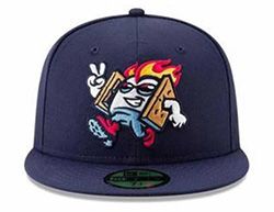
The people love Toasty Vibes. The mascot is just one of two designs to grace this list for the second straight year. Introduced prior to the 2019 season as part of a Brandiose rebrand by the Colorado Springs Sky Sox, the sweet figure represents the area’s love for hiking and relaxing (or telling ghost stories) by a campfire. Toasty’s got a graham cracker vest, fresh shades and fiery hair as he flashes a smile and a peace sign. Klein said the appeal for food logos, the local connection and the “fun, youthful colors” are what keeps people coming back for more Toasty. As Rocky Mountain transitions to the new partner Pioneer League in 2021, Klein is interested to see how the creativity may grow in an independent circuit.
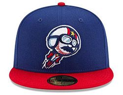
Raspas de Corpus Christi's 2019 edition
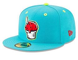
Corpus Christi has been rocking the Raspas since 2018 as one of the founding teams of Copa de la Diversión, but every season, they bring a different twist. Starting with a blue, green and red icy treat, the Hooks transitioned to a deep red with a bright green background in 2019 before combining the two for tri-color (this time orange, pink and red) on a green hat in 2020. While the latest edition is picking up steam this month, the 2019 creation remains a fan favorite. "I think the Raspas are really unique to south Texas down here because it's a part of the culture,” said Hooks ballpark entertainment manager Amy Johnson. "We've got fans all over town and it's just a fun summer treat, really, so it's cool that the different people like that." Be sure to snag a fruity treat before it melts as Johnson mentions the Astros’ Double-A affiliate has plans to go in a different direction for this year’s Copa theme.
Gwinnett Stripers' alternate tail
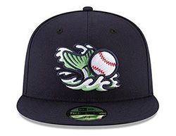
Another Brandiose creation, this Stripers alternate logo hooked fans in its third year of existence. While there are several fish-related logos in the Minors, this rebrand was an opportunity to focus on the fishing aspects and the built-in fans that go along with that activity. If you love baseball and fishing, this is the perfect hat for you. Klein said Brandiose provided the Braves’ Triple-A affiliate with “a family of marks, which are different logos” to give fans variety when shopping and the club promotional options down the line. This year, it was the fish tail and baseball design that really made a splash and sold out. But fear not, there is also the similarly popular worm on a line hat (it’s “kind of like our villain”) that is available.
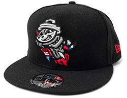
The Trash Pandas are the only cap to make this list three years in a row. And they still haven’t played a single game. The Angels’ new Double-A affiliate was announced in the fall of 2018 and set to take off in 2020 before getting grounded by the pandemic. But the logo continues to soar as the Trash Pandas and Brandiose found a way to make a raccoon in a trash can look good. Rocket City, the nickname for Huntsville, Alabama, is home to NASA and soon the Space Force. It also boasts an inordinate amount of engineers, which is where the crafty raccoons come in, as they’re considered to be “the most ingenious animals.” Klein thinks fans across the county gravitated to the head-turning name, the patriotism of the colors and the aspirational reminder that Americans put men on the moon.
Harrisburg Senators' George Washington
When the Nationals won the World Series, Klein and his team called Harrisburg general manager Randy Whitaker with an idea to help the Double-A affiliate join in on the celebration. To avoid the rubber stamps and red tape that can slow the process down, Klein said they wanted to celebrate Washington without the Nationals logo. And what better way than to honor the namesake himself: George Washington. The team took the founding father and gave him the modern gear to be ready for any clubhouse celebration. The only problem was that the hats were going to take six months to produce. Wanting to capitalize on the World Series reign, Brandiose suggested the Senators open the hat up for pre-sale, which not only was a booming success for the George Washington cap, but became the playbook for how Minor League teams handled the pandemic slowing down production. “Most clubs look to Harrisburg as coming up with an incredibly innovative idea and being able to pre-sell. And so you saw all summer 2020 [teams were] pre-selling everything,” said Klein.
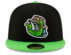
Rochester Red Wings' Grim and Depressing Reaper
Hell hath no fun like a Minor League city scorned. After New York Post writer Maureen Callahan called Rochester “grim and depressing” in an article about a Brooklyn grocery store, the Red Wings did what many Minor League clubs do -- turned it into a promotion. “For a cap that's grim and depressing, we didn’t think it could be too outrageously colorful, so we wanted to make sure it had some black and it had some grey in there and have it have a little bit of an edge to it," said Dan Mason, the Triple-A Rochester GM. The skeleton of the Red Wings mascot plays death personified in this Brandiose design, which was unveiled in November 2019 as a T-shirt. The hats were released on Aug. 21, 2020, the date of the originally scheduled Maureen Callahan Night. While many might feel like the look suited 2020, the hat will surely continue to generate attention this year when the glow-in-the-dark fitted cap is released.
Kannapolis Cannon Ballers road cap
Like the Trash Pandas, the Cannon Ballers are still waiting to blast off on the field. But that hasn’t slowed the fan base for the Class A White Sox affiliate. After rebranding from the Dale Earnhardt-inspired Intimidators name, Kannapolis found a new moniker in the Cannon Ballers in October 2019. The name is a play on the Cannon Mills Company, a vital part of Kannapolis’ history, while the Studio Simon-designed logo gives a nod to the racing legend and a carnival-like atmosphere the team hopes to bring to the ballpark. “The minute we saw it, we said 'This is it!” Kannapolis GM Matt Millward said upon launch. What gives this road cap the edge over its home counterpart is the red bill that balances the design.
Myrtle Beach Pelicans' Palmetto State
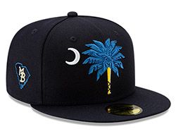
Seeing other teams celebrate their cities’ nicknames, the Pelicans wanted in. But because Myrtle Beach didn’t have something like Jacksonville’s "Bold City," the team thought, what if we honor our state’s famous flag? Brandiose took on the challenge of making a South Carolina state logo hat that looked different from a cap you could buy at the beach or airport. They turned the trunk into a bat with tape and stylized the branches to make it pop. And what literally makes this cap stand out is the embroidery technique. Klein said “the bat is flat, but then the different leaves are stacked, embroidered in 3D, so it feels more like a sculpture or almost like a 3D/coming-at-you palmetto.”
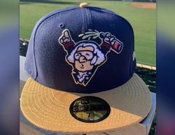
Frisco RoughRiders' Smiling Teddy
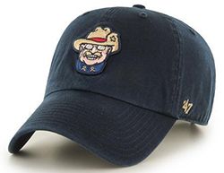
There aren’t too many logos in which the mascot is smiling, but Frisco’s Teddy joins Toasty in this club. While the design represents Theodore Roosevelt from his Rough Riders cavalry days, Klein said it was important to capture the more famous expression of the former president: a large grin. Smile or not, the Brandiose design elicits an historic, yet familiar face that draws people in. “Teddy Roosevelt was quite the character,” Klein said. “And he was brash and sort of bold and had this bravado, which is not unlike Texas.” Smiling Teddy does come in a fitted look, but it was the adjustable version that cracked this list.
In what Hartford calls its most popular night of the year, the club gives fans a taste of a name they could have chosen instead of Yard Goats in 2015. In 2019, the brand of the night was the fan-submitted River Hogs, a name that comes from the local Hog River. With this new design, Hartford takes the blue, green and tan from their Yard Goats logo and turns up the volume to create a bright, snarling creature emerging from the water, ready to play. “What could have been” designs tend to be pretty popular due to the nostalgia and rareness, and this one packs an extra punch with the bright green jumping off the black panels.
Kelsie Heneghan is a writer for MiLB.com. Follow her on Twitter @Kelsie_Heneghan.