

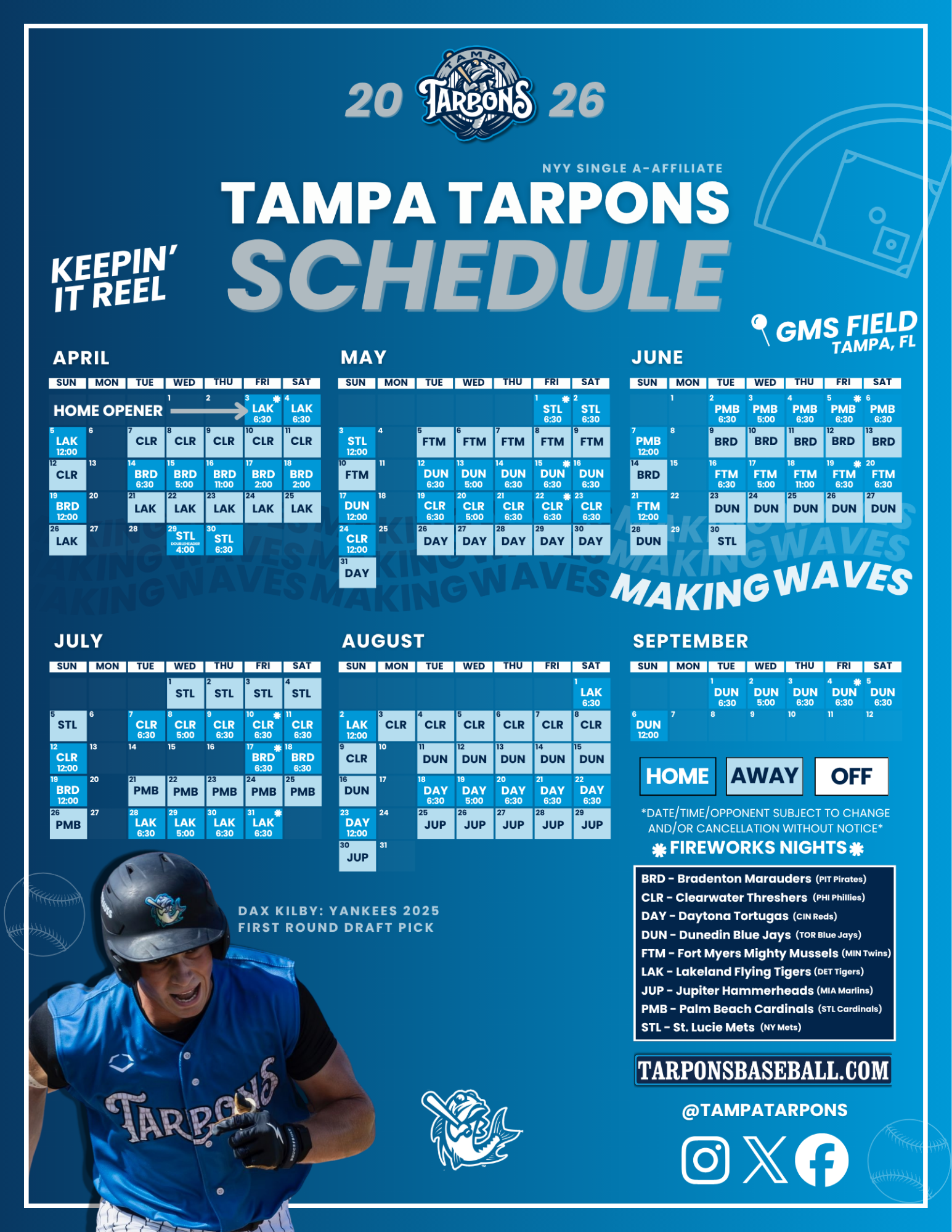
These 10 hats took the crown in 2023
From historic to anthropomorphic, Minor League hats are something else. They can represent the city, the culture, the cuisine, and they look good doing it. For the sixth straight season, MiLB celebrates National Hat Day by looking at some of the top-selling Minor League caps per New Era and MiLBStore.com.
From historic to anthropomorphic, Minor League hats are something else. They can represent the city, the culture, the cuisine, and they look good doing it.
For the sixth straight season, MiLB celebrates National Hat Day by looking at some of the top-selling Minor League caps per New Era and MiLBStore.com.
Past lists: 2018 | 2019 | 2020 | 2021 | 2022
Before we dive into the cream of the cap, a few honorable mentions. The Rocket City Trash Pandas' hat is a perennial favorite, and this year, their Copa de la Diversión identity, Lunáticos, drew in the fanatics. The Richmond Flying Squirrels' Marvel’s Defenders of the Diamond look featuring a righteous rodent was one of the most popular from the superhero series. Also, the Rome Emperors made quite the entrance when the brand was unveiled in mid-November.
Buffalo Bisons
Buster is sliding into the hearts of hat wearers everywhere. The “retro slide” design -- which Buffalo first rocked from 1998-2008 -- features the mascot sliding into home plate, creating a cloud of dust in the background as "Bisons" flashes above, almost like a title card. New Era, whose headquarters is less than a mile from Sahlen Field, has created several versions of the look in a variety of colors that continue to find new audiences. The khaki and red one, for instance, was an international hit. Buffalo also has another sensation with its Marvel’s Defenders of the Diamond cap, which also graced this list last year. Tapping into the icy weather Buffalo is known for, this hat features a frigid Bison that is staring you down. “It's just Buffalo's way of being able to forge through and herd on through the heavy winters and the heavy snow that we have, and maybe we can ice out our opponents and last even in the tough times,” said Theresa Cerabone, manager of retail, licensing and entertainment.
Queens Kings
The Queens Kings only played one season in the Minors, but their reign continues 23 years later. Meant to be a temporary stop before the Brooklyn Cyclones’ home in Coney Island was ready, Queens brought it with the design from the jump. As part of Minor League Baseball’s Hometown Collection, brands like the Kings live on and even get updated looks, like this Queen of Hearts cap. As with most of the club’s designs, the playing card king pops out of the Q. In this case, the logo is surrounded by a yellow glow against the stark white backdrop. This crown features a heart in one of the eyelets, as well as a hand of cards on the side that is one shy of a royal flush.
Sacramento River Cats
Since 2019, the River Cats have rocked Cardinal red as their primary cap. The deep color and monotone bill make for a unique twist on a classic look. The black RC is lined with River Cats Gold to complete the club’s signature color palette. “Because that's the one that the team wears the most on our field, I think that's the one that our fans recognize the most as River Cats,” said Erin Kilby, Sacramento’s director of merchandise. “Both the black and the cardinal RC are very classic and seen all over our ballpark.” Kirby has also heard from several people with the initials RC that are drawn to the hat.
Tacoma Rainiers
After making a splash in 2021, the Rainiers’ navy on-field home cap returns to this list and brings the alternate red hat with it. An homage to the defunct, yet beloved Rainier Brewing Company, the “iconic” Rainier R has been with the club since its 1995 inception, while the red was incorporated in 2009. “People are proud to wear it,” said Ashley Schutt, the club’s director of baseball ops and merchandise. “We have over 30 different variations of our hat in our store right now, but I think people will always gravitate toward that navy and red just with that simple and classic design.”
Hartford Yard Goats
Is this the GOAT of goat hats? Yes. Hartford’s home cap makes this list for the second straight season, this time with the green bill, which not only adds a pop of color, but a local flair. Green and blue are a popular combo in the city of Hartford, first worn by the also defunct, yet beloved, Whalers, and now by the USL’s Hartford Athletic. The cap combines the history of the area -- a yard goat is a railroad term -- while bringing the whimsy of a fierce goat chewing a bat. “I'm very happy that people are also admiring what we do here in Hartford,” said merchandise manager Ryan Sandler, who grew up in the area. “We ship around the country; we ship around the world as well. … I think it just really embodies Hartford as a whole from the colors to just the pride that the city of Hartford has for people, the team and everything else in between.”
El Paso Chihuahuas
Since 2019, the Chihuahuas have taken on the Margaritas identity for Copa de la Diversión to celebrate the refreshing drink that was created in Juárez, Mexico, just across the border from El Paso. In 2023, the club gave the cocktail design a twist by making it a strawberry margarita. The bold shades of the traditional red and blue provided a more palatable look from the previous neon green -- though the shade still provides some pop on the hat. El Paso’s classic on-field cap also remains a popular choice among locals and those across the country, as well as the chihuahua swinging a bone bat. “You have a lot of people who leave El Paso but are still part of the El Paso community,” said David Apodaca, the Chihuahuas' retail and merchandise operations manager. “So for them, having a chihuahua hat only makes home closer to them.”
Albuquerque Isotopes
It’s hard to talk about Copa de la Diversión without mentioning Albuquerque’s Mariachis de Nuevo Mexico identity, which has taken home the prize in three of the five seasons a winner has been named. After initially sporting a red design, the club injected turquoise, providing another tie to the Southwest while also creating an eye-catching colorway. “The sugar skull on the front of the cap is a huge part of Hispanic culture, and it really resonates with our fan base here in Albuquerque and in the state of New Mexico,” said Forest Stulting, the club’s media relations manager. “It's become a very signature hat and logo for not only the Isotopes, but the city itself.”
Durham Bulls
Arguably the most famous Minor League hat, the snorting bull running through the D gained notoriety with the 1988 film “Bull Durham.” Both the hat and the movie have withstood the test of time well. The orange pops off the blue, while the bull brings the ferocity in this simple, yet thoughtful design. The city’s initial evokes historic origin ballcaps, while the animal speaks to the evolution of design by the industry. “It's just iconic,” said Bryan Wilson, the team’s director of merchandise. “It's a symbol of the Durham Bulls and more importantly, it's a symbol of Minor League Baseball.”
Hudson Valley Renegades
Now for something tasty. Wanting a local food identity, the Renegades turned to the cider donut, a signature fall treat that takes advantage of nearby orchards. The design stars Dusty, who, naturally, is covered in cinnamon dust. Dusty holds an apple with baseball seams in one hand and an apple cider jug in the other as he blissfully takes a stroll. Conjuring fall leaves, the dark green and burnt orange colorway provides a breath of fresh air among classic cap options. Marking the first time the Yankees’ High-A club wore an alternate identity outside of Copa, fans proved the appetite was there. On the Cider Donuts’ debut game day, the club broke a single-game sales record. “It is such a different looking, fun logo,” said team PR director Joe Vasile. “It's something that's really kind of eye-catching. … Any time I wear it, I get a bunch of random people coming up to me like, ‘What is that?’”
Eugene Emeralds
What started as a comedic tragedy in 1970 ended up as one of the most popular alternate identities in the Minors. Honoring the video of a beached whale that was blown up in a failed attempt at an efficient cleanup that eventually went viral decades later, Eugene donned the Exploding Whales persona. The hat features a whale with a “quirky smile” holding a lit stick of dynamite. “It's a unique character; it's not super angry like these typical logos you see,” general manager Allan Benavides said. “I think the color combination of the light blue and the red just pops really well along with the hat. And it's just been a dynamic piece.”
Kelsie Heneghan is a writer for MiLB.com. Follow her on Twitter @Kelsie_Heneghan.